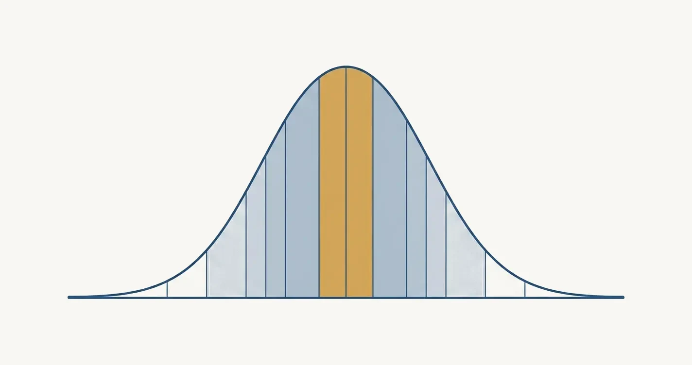
The IQ distribution, band by band, and where real scores depart from the curve
The IQ distribution is a bell curve centered on 100, and a table can show exactly how many people sit in each 5 point band. That shape is mostly a design, because test publishers fit raw scores to a normal curve. This page gives the share of people and the count per million from 55 to 145, then shows where real score distributions depart from the curve.
The drawing carries no scale and its bands are not the 5 point bands of the table, but on a normal curve with a mean of 100 and a standard deviation of 15 the central ten points, 95 up to 105, hold 26.1 percent of all scores (our arithmetic).
0 The short answer
On the standard IQ scale, scores form a bell curve with a mean of 100 and a standard deviation of 15, which puts about 26.1 percent of people from 95 up to 105 and 99.73 percent from 55 up to 145. That shape is mostly built in, because publishers convert raw scores so that the norm sample fits a normal curve. Evidence on real score distributions is thinnest at the edges, where floors, ceilings, small norm samples and the Flynn effect make published scores less certain than the curve suggests. The table below gives the share of people and the count per million for every 5 point band.
26.1 percent
Share of people scoring from 95 up to 105, the two central 5 point bands (our arithmetic on the normal curve).
99.73 percent
Share of people scoring from 55 up to 145, three standard deviations either side of 100 (our arithmetic).
1,350
People per million at or above 145, and the same number below 55 (our arithmetic).
The IQ distribution is a symmetric bell curve centered on 100, and its width is set by one number, the standard deviation, which is 15 on the scale used by the major adult batteries. The horizontal axis is the score. The vertical axis is density, the relative frequency of scores near each point, which is why the curve peaks at 100 and falls away on both sides. In a normal curve the mean, the median and the most common score sit at the same point, so half of all people score below 100 and half above. The page on the average IQ sets out the familiar rule that about 68, 95 and 99.7 percent of scores fall within one, two and three standard deviations, and this page does not repeat it. The page on why the standard deviation is 15 explains what changes on other scales.
The area under the curve is the share of people, and the height is not. This is easy to misread on a distribution chart. Pearson's clinical assessment primer, read on October 6, 2026, labels the share of people under each standard deviation slab of the curve: 34.13 percent between 100 and 115, 13.59 percent between 115 and 130, 2.14 percent between 130 and 145 and 0.13 percent beyond 145, with the mirror image below 100. Our own arithmetic on the normal curve gives the same slabs, with 0.135 percent for the last one.
The height tells a different story. The curve peaks at about 2.66 percent of people per IQ point at 100. At 130, two standard deviations out, it stands at 13.5 percent of its peak height, at 145 at 1.1 percent and at 160 at 0.03 percent (our arithmetic). That is why the tails look flat on a chart even though they are not empty: a line close to the axis still encloses people, and the table in the next section counts them.
Two more landmarks help with reading the chart. The curve changes from bending downward to bending upward at 85 and 115, one standard deviation either side of the mean, so the curve is steepest at those two marks and flattens both toward the center and toward the tails. The middle half of the population runs from about 89.9 to 110.1 (our arithmetic), so one person in two scores within about 10 points of 100, and a little more than one person in four scores within about 5 points.
A last point concerns what the curve is not. It is not a ranking of human worth, not a picture of every ability and not a fixed fact of nature. It is the distribution of scores on one scale, in one reference group, at one date. The reference group and the date are what the later sections return to, and the page on what an IQ test measures covers what the number summarizes.
2 How Many People Fall in Each 5 Point IQ Band?
On a normal curve with a mean of 100 and a standard deviation of 15, the two busiest 5 point bands are 95 to under 100 and 100 to under 105, with 13.06 percent of people in each, and every band farther from 100 holds fewer people than the one before it. The table gives all 18 bands of 5 points from 55 to 145, the two open tails beyond them, the distance of each band from the mean in standard deviations, the share of people, the count per million and the cumulative share at the top of each band. Every figure is our arithmetic on the normal curve. None of it is a count from a norm sample, and the later sections show where measured data differ.
IQ band
Standard deviations from 100
Percent of people
People per million
Cumulative percent at the top of the band
Below 55
below -3.00
0.135
1,350
0.135
55 to under 60
-3.00 to -2.67
0.25
2,480
0.38
60 to under 65
-2.67 to -2.33
0.60
5,985
0.98
65 to under 70
-2.33 to -2.00
1.29
12,935
2.28
70 to under 75
-2.00 to -1.67
2.50
25,040
4.78
75 to under 80
-1.67 to -1.33
4.34
43,421
9.12
80 to under 85
-1.33 to -1.00
6.74
67,444
15.87
85 to under 90
-1.00 to -0.67
9.38
93,837
25.25
90 to under 95
-0.67 to -0.33
11.69
116,949
36.94
95 to under 100
-0.33 to 0.00
13.06
130,559
50.00
100 to under 105
0.00 to 0.33
13.06
130,559
63.06
105 to under 110
0.33 to 0.67
11.69
116,949
74.75
110 to under 115
0.67 to 1.00
9.38
93,837
84.13
115 to under 120
1.00 to 1.33
6.74
67,444
90.88
120 to under 125
1.33 to 1.67
4.34
43,421
95.22
125 to under 130
1.67 to 2.00
2.50
25,040
97.72
130 to under 135
2.00 to 2.33
1.29
12,935
99.02
135 to under 140
2.33 to 2.67
0.60
5,985
99.62
140 to under 145
2.67 to 3.00
0.25
2,480
99.87
145 and above
3.00 and above
0.135
1,350
100.00
The 18 bands together hold 99.73 percent of people, which is 997,300 per million, and the two tails hold the remaining 0.27 percent. The lower half mirrors the upper half to the last digit, because the normal curve is symmetric. A real distribution need not be, and the sections on the tails explain why the mirror breaks first at the bottom.
A few readings make the table concrete. The two central bands hold 26.1 percent between them. The span from 90 up to 110 holds 49.5 percent, so it is close to the middle half of the population. When scores are rounded to whole numbers, the single score 100 corresponds to the interval from 99.5 to 100.5, which holds about 2.66 percent of people, or 26,590 per million. In a group of 100,000 people drawn from the reference population, about 13,060 would fall in each central band and about 250 in the band from 140 to under 145. All of these are our arithmetic.
How to read the bandsThe bands are continuous intervals that include the lower edge and exclude the upper edge. IQ scores are usually reported as whole numbers, so a reader who groups the whole numbers 95 through 99 is looking at the interval 94.5 to 99.5, which holds 12.98 percent of people and not 13.06 percent (our arithmetic). The percent column is rounded to two decimals and the per million column to whole people, so rows may not sum exactly.
3 Why Is the IQ Distribution a Bell Curve? The Scale Is Built to Be One
The bell curve in an IQ report is mostly a construction, because publishers convert raw scores into standard scores that are fitted to a normal curve. A raw score is the sum of the item scores, and Pearson's primer says that raw scores are not directly interpretable and are not comparable from one subtest to the next. A standard score fixes that by transforming each raw score according to its position on the normal curve, so that the mean and the standard deviation are set in advance, for example 100 and 15. The primer adds that standard scores are called standard because the original distribution of raw scores has been transformed to produce a normal curve.
The procedure, in outline, has four steps. This is our description of the general logic, and the details vary by publisher. First, the test is given to a norm sample, grouped by age. Second, each raw score is ranked within its age group and converted to a percentile. Third, the percentile is mapped to the point on the normal curve that has the same share of people below it. Fourth, that point is rescaled to a mean of 100 and a standard deviation of 15. In a hypothetical case, a raw score at the 84.13th percentile of its age group sits one standard deviation above the center of the curve, so it becomes 115, and a raw score at the 50th percentile becomes 100. The page on how IQ is calculated follows the whole chain from answers to index, and the page on how IQ scores are normed covers the norm sample and its age bands.
A published example shows the practice. Canivez's review of the WAIS-IV, written for the Eighteenth Mental Measurements Yearbook, describes a standardization sample of 2,200 people obtained by stratified proportional sampling across age, sex, race and ethnicity, education and region. Subtest scaled scores, with a mean of 10 and a standard deviation of 3, were derived within each of 13 age groups by a method of inferential norming, in which means, standard deviations and skewness were examined through polynomial regressions and compared with theoretical distributions. Composite scores, with a mean of 100 and a standard deviation of 15, were generated by summing the subtest scaled scores and normalizing them, with the composite distributions visually smoothed to remove irregularities. For the subtest scores, the reviewer added that minor irregularities were reportedly corrected through smoothing, but that the method, statistical or by hand, was not noted. In our reading, the published curve is therefore a fitted curve with decisions about smoothing built into it, and not a raw histogram of what the norm sample did.
Why do publishers do this? Standard scores sit on an equal interval scale, the primer explains, so a 10 point gap means the same distance wherever it falls, while percentile ranks do not have equal intervals. On a normal curve, percentiles and standard deviations line up in a fixed way, and in a skewed distribution they do not. The glossary of the Standards for Educational and Psychological Testing defines a scale score as a score obtained by transforming raw scores, typically to facilitate interpretation. The APA Guidelines for Psychological Assessment and Evaluation, approved in March 2020, add that knowing the process and the assumptions behind such transformations is typically considered essential for proficient test use.
The consequence for this page is direct. Because the transformation fits the norm sample to a normal curve, the question of whether IQ scores are normally distributed cannot be answered from the norm sample's own scores. A real test of the shape needs data that the scale did not shape, and the next sections look for them.
A bell shape is also a sensible target and not an arbitrary one. A test total is a sum of many item scores, and sums of many small contributions tend toward a bell shape, which is the central limit idea. That is our explanation and not a finding of the sources. It predicts a good fit in the middle of the range and gives no guarantee at the edges, which is where this page spends most of its time.
4 Is Intelligence Itself Normally Distributed, or Only the Scores?
Whether reported scores are normal is settled by how they are built, whether the underlying ability is normal is an empirical question, and the studies reviewed here answer it only in part. Three claims hide inside the phrase "IQ is normally distributed." The first is that the scores of a norm sample are normal, which is true by construction. The second is that the ability itself would be normal on a scale that nobody had fitted to a curve. The third is that scores in a later population, measured against old norms, keep a normal shape. Only the first is guaranteed. The second cannot be read off any single instrument, because every scale embeds choices about items and scoring, so it can only be probed by comparing instruments or by examining distributions that were not fitted. The page on what intelligence is covers the construct itself.
Micceri's 1989 survey in Psychological Bulletin is the broadest check on how measured distributions behave. It examined 440 large sample achievement and psychometric measures and found all of them significantly nonnormal at the .01 level. It reported several kinds of contamination: tail weights ranging from the uniform to the double exponential, asymmetry at the exponential level, severe digit preferences, multimodality and modes outside the interval between the mean and the median. Two cautions keep the result in proportion. It covers achievement and psychometric measures in general and not intelligence batteries alone. And with samples that large a significance test flags small departures, so nonnormal in this sense does not mean far from normal, which is our statistical caution and not the author's claim. The paper's own target was statistical practice. It concluded that the tenets of normality assuming statistics look fallacious for such data, and also that the distributions used in earlier robustness research did not match real ones.
The Pearson primer adds a clinical caution: not all constructs are normally distributed, and a task that most children of one age can do easily produces scores that pile up at the top and taper slowly below, a negatively skewed distribution. Canivez notes that the WAIS-IV revision added easier and more difficult items to improve coverage and range, which, in our reading, is one way a battery avoids piling raw totals up at either end.
The table collects the sources that bear on shape, so that each can be read for what it examined and not for what a headline made of it.
Survey of the distributional shape of 440 large sample achievement and psychometric measures
All significantly nonnormal at the .01 level, with tail weights from the uniform to the double exponential, asymmetry, digit preferences and multimodality
Scaled score distributions in 49 WAIS-III and 50 WISC-III clinical assessment records
WAIS-III scaled scores were approximately normal with very few scores of one, while the WISC-III distribution was skewed with more scaled scores of one than any other
Conscription data from Sweden and Israel with sibling and twin comparisons
Causes of the lowest 3 percent of scores resembled causes of variation in the normal range, while causes of the lowest 0.5 percent differed
Three conclusions follow so far. The reported distribution is normal by design. Measured distributions of psychometric variables in general are rarely exactly normal. And the sources that test the shape of intelligence scores themselves concentrate on the two tails, which are the subjects of the next two sections. For the middle of the range, this page found no study that measured the whole distribution on a scale that was not fitted to a curve, and it does not claim one.
5 Are There More Very High Scores Than the Normal Curve Predicts?
The claim that a normal curve underestimates the number of very high scorers has been tested directly, and the most direct test reviewed here, ten large representative datasets, mostly did not support it.
Warne, Godwin and Smith named the claim the overabundance hypothesis, the belief among some gifted education researchers and practitioners that the general population holds more gifted people than a normal distribution predicts. They searched public datasets and the published literature for large representative datasets and found 10, in 6 sources. The abstract reports that the hypothesis was mostly unsupported by the data, and that most datasets included approximately the same number of gifted individuals as a normal distribution predicts, or fewer. The authors close by exploring the theoretical reasons why an overabundance is likely untrue and why some people might believe otherwise.
For the table, this means that the upper rows are not contradicted by the most direct test reviewed here. The result concerns the number of gifted people, however the paper defines the cutoff, and it is not a measurement of each 5 point band. The page on the gifted IQ range places the usual cutoffs on the curve, and the rarity calculator turns any upper score into a one in X figure on the same normal model.
A departure in the tails can also go in either direction. Micceri's range of tail weights runs from the uniform, which has lighter tails than the normal curve, to the double exponential, which has heavier ones. A claim of heavier tails is therefore one of two possible departures, and in our reading, the datasets of Warne and colleagues fit a normal or lighter upper tail better than a heavier one.
The tails are the hardest part of any distribution to measure, because few people are there. A norm sample of 2,200 people, the size of the WAIS-IV sample in the review cited above, would hold about 5.5 people in the band from 140 to under 145 if the normal curve were exactly right. Chance alone moves a count that small by about 2.3 people, which is 43 percent of the expected count (our arithmetic, treating the count as a Poisson variable). A single norm sample of that size cannot show whether the band truly holds 2,480 people per million or a third more or fewer. Whether the upper tail is heavier, lighter or normal is therefore a question for very large datasets, and the 10 datasets of Warne and colleagues are the kind of evidence that can address it.
6 What Happens at the Low End of the IQ Distribution?
The low end is where the normal curve is most likely to mislead, because the people there include the low extreme of ordinary variation and a smaller group with distinct causes, and a score below 70 is a position on a scale and not a diagnosis.Reichenberg and colleagues trace the hypothesis to Lionel Penrose in 1938: most intellectual disability is the lowest end of the normal distribution of IQ, and severe intellectual disability is etiologically distinct. They tested both parts with cognitive assessments from compulsory military service in Sweden from 1968 to 2010, covering 3 million 18 year old males, and in Israel from 1960 to 2005, covering 2.1 million 17 year old males and females, with 98 percent male participation in both countries. The design used 400,426 non-twin pairs of brothers and 8,788 male twin pairs in Sweden and 610,391 sibling pairs in Israel.
The abstract reports that the factors influencing mild intellectual disability, the lowest 3 percent of the IQ distribution, were similar to those influencing IQ in the normal range, while the factors influencing severe intellectual disability, the lowest 0.5 percent, differed. The authors conclude that most severe intellectual disability is a distinct condition, qualitatively different from the larger group that represents the low extreme of the normal distribution of intelligence. On the normal model the lowest 3 percent of scores lies below about 72 and the lowest 0.5 percent below about 61 (our arithmetic).
Our reading of what that means for shape is limited. If the lowest 0.5 percent of people includes a distinct condition with its own causes, the number of people below about 61 need not follow the normal curve of ordinary variation, and in that range the table is only a model. The paper tested causes and not frequencies, so it does not show by itself how many more or fewer people sit there than the curve predicts. The model puts 0.38 percent of people below 60, which is 3,830 per million.
A score is also not a prevalence. The normal curve puts 2.28 percent of people below 70, about 22,800 per million. Maulik and colleagues pooled 52 population based studies published from 1980 to 2009 and estimated the prevalence of intellectual disability at 10.37 per 1,000 people, about 1 percent. Their abstract adds that estimates were higher in low and middle income countries, higher in children and adolescents than in adults, and higher in studies that identified cases with psychological assessments or scales than in those that used standard diagnostic systems. The pooled prevalence is about 0.46 times the share of the normal curve below 70 (our arithmetic). The two numbers answer different questions, because one describes a score and the other a diagnosis.
Winter, Trudel and Kaufman summarize the diagnostic side. In their account of the DSM-5-TR, intellectual disability is marked by deficits in adaptive functioning as well as deficits in intellectual functioning confirmed by clinical assessment and standardized testing. They note that people with intellectual disability typically perform at least two standard deviations below the mean, a range they give as 65 to 75 once 5 points of measurement error are allowed, and that diagnosis depends on adaptive behavior as well as IQ. A group statistic is never an individual diagnosis. The page on what a low IQ is covers the ranges below 85 and 70, and the next section covers how far any test can measure down at all.
7 Why Do IQ Tests Have a Floor and a Ceiling?
Every test can report only a lowest and a highest score, and beyond about 3.3 standard deviations a norm sample of about two thousand people holds too few cases to anchor the scale, so extreme published scores rest on the statistical model more than on observed people. A raw score cannot fall below zero or rise above the number of items, and when a test is too easy or too hard for the people taking it, scores pile up at one end. The Pearson primer describes the same pattern as skew, with scores bunching at one end of the scale and tapering slowly at the other.
The floor has been studied most closely in the Wechsler tests. Whitaker and Wood start from the point that the WAIS-III and the WISC-III give a scaled score of one even when the raw score is zero, which could create a hidden floor. They examined 49 WAIS-III and 50 WISC-III assessments from clinical records. They concluded that there is potentially a significant floor effect on the WAIS-III at IQs in the 40s and 50s and on the WISC-III up to IQs in the 70s. A scale that cannot tell a very low score from a lower one makes the bottom of a distribution look bunched and cut off compared with the people underneath it.
The published range sets the outer limit. Canivez's review states that the WAIS-IV Full Scale IQ ranges from 40 to 160, which is plus or minus 4 standard deviations, and that this represents a two thirds standard deviation increase in measurement range over the WAIS-III. The reviewer judged it wide enough for most clinical applications. The sample behind the scale is smaller than the range suggests. The WAIS-IV norm sample had 2,200 people. Winter, Trudel and Kaufman report that the WAIS-5 was standardized between February 2023 and January 2024 on 2020 adolescents and adults aged 16 through 90, a figure printed without a thousands separator that we read as 2,020, with 180 per age band for ages 16 to 69 and 100 per age band for ages 70 to 90.
The Pearson primer states that the accuracy of any standard score depends on the accuracy of the raw score mean and standard deviation obtained from the normative sample, and that the sample must be large enough to give stable estimates. The table shows what that means at the edges. If the normal curve were exactly right, one person in 2,200 would score at or above about 149.8, and one person in 2,020 at or above about 149.4. Every figure below is our arithmetic.
Score
Percent of people at or above it
Expected people in a sample of 2,020
Expected people in a sample of 2,200
130
2.275
46.0
50.1
145
0.135
2.7
3.0
150
0.0429
0.87
0.94
155
0.0123
0.25
0.27
160
0.0032
0.06
0.07
The same numbers apply below 100, with 70, 55, 50, 45 and 40 in place of the scores above. At 160, the upper end of the published WAIS-IV range, a sample of 2,200 would be expected to hold 0.07 of a person. Within an age band the samples are smaller still, and a band of 180 people would hold about 0.24 of a person at or above 145. No sample of that size can show where a score of 160 falls, so such a score rests on the statistical model fitted to the sample, which is what the regressions and smoothing described earlier supply. That is our inference from the sample sizes, and it is why the extreme rows of the table above are a model and not a census.
A ceiling also changes what a chart can show. When a test lacks hard items for the group taking it, scores pile up near the top and the upper tail is cut off, which gives a negatively skewed picture even if the underlying ability is not. The page on measuring above the usual ceiling covers the instruments built for the far upper range, and the page on the WAIS-5 lists the age range and structure of the current Wechsler battery.
8 How Does the Flynn Effect Move the Bell Curve?
Each time norms age, the Flynn effect moves the real curve away from the published one, and the studies disagree on whether it moves the whole curve together or mainly lifts the lower half, which matters because the tails react far more than the middle. The size of the shift has been measured. Trahan and colleagues pooled 285 studies, with 14,031 people, since 1951 in which people took two intelligence tests with different normative bases. The mean was 2.31 standard score points per decade, with a 95 percent confidence interval of 1.99 to 2.64. For 53 comparisons involving modern Stanford-Binet and Wechsler tests, those since 1972, and excluding three atypical studies, it was 2.93 points per decade, with an interval of 2.3 to 3.5. For those modern tests, ability level was not a significant moderator, and the authors read the results as supporting the robustness of the effect across levels of performance. The page on the Flynn effect covers the effect itself, and this section covers only what it does to the shape.
The pace can change. Winter, Trudel and Kaufman analyze the counterbalanced studies in the WAIS-5 manual. In 186 people tested on the WAIS-IV and the WAIS-5 the mean Full Scale IQ was 101.6 on the older test and 99.7 on the newer one, a difference of 1.9 points, which they put at 1.2 points per decade, well below the traditional 3.
Shifts matter most in the tails. If a population averaged 110 on old norms with the same spread, 9.12 percent would score above 130 instead of 2.28 percent, four times as many, and 0.38 percent would score below 70 instead of 2.28 percent (our arithmetic). That is why an old chart looks wrong in the tails first, and why the middle of the table barely moves while the outer rows change several fold.
Where the gains land is disputed. Teasdale and Owen analyzed two samples of males from the Danish draft board, of 32,862 and 6,757, and reported that gains in intelligence test scores were continuing and were concentrated among lower intelligence levels. The title of the paper adds a stable prevalence of high intelligence levels. Hegelund and colleagues later covered all Danish men born from 1940 to 2000 who appeared before a draft board, 1,556,770 in all. They set the 1940 cohort as the baseline, a mean of 100 with a standard deviation of 15, and estimated a mean of 108.9 with a standard deviation of 12.2 for the 1980 cohort, after which the mean fell. The values for the 1980 cohort were interpolated, because complete test scores were available only for the cohorts born from 1940 to 1958 and from 1987 to 2000.
Take those two parameters and assume a normal shape, which the study does not claim. The 1980 cohort would then have 4.2 percent above 130 and 0.07 percent below 70, against 2.3 percent in each tail on the 1940 baseline (our arithmetic). On those numbers the curve both moved up and narrowed, so the low tail nearly emptied while the high tail not quite doubled.
The other reading comes from Wai and Putallaz, who examined roughly 1.7 million scores of 7th grade students on the SAT and ACT and of 5th and 6th grade students on the EXPLORE from 1981 to 2010. They found the effect in the top 5 percent at a rate similar to the general distribution, and read it as evidence that the entire curve is likely rising at a constant rate. Those are the SAT, the ACT and the EXPLORE, taken by young students, and not IQ batteries, and the abstract adds that the effect was primarily concentrated on the mathematics subtests, so the results cannot be placed directly on the IQ scale. The Danish conscript data point to gains concentrated at lower levels, and the narrowing standard deviation fits that reading, though Hegelund and colleagues do not frame it that way. The student test data point to a curve that rose together. The difference may come from the tests, the populations and the periods, and this page cannot settle it.
The direction is not fixed either. Bratsberg and Rogeberg used administrative register data and military conscription scores from three decades of Norwegian birth cohorts, 1962 to 1991, and showed that the observed Flynn effect, its turning point and the later decline can all be recovered from variation within families. The title of the paper states the conclusion: the Flynn effect and its reversal are both environmentally caused. A published curve is always centered on 100 at its own norming date, and the real curve drifts away from it in either direction. The Standards for Educational and Psychological Testing, discussed at the end of this page, note that the usefulness of norms may diminish over time and that tests in use for years need periodic review of them. A distribution chart without a norm date is a chart with a missing axis.
9 Does the Shape Change on Scales With a Standard Deviation of 16 or 24?
The shape does not change, only the number of points the same people spread across, so the share of people in a 5 point band depends on the scale. The Pearson primer draws scaled scores with a mean of 10 and a standard deviation of 3, standard scores with a mean of 100 and a standard deviation of 15 and T scores with a mean of 50 and a standard deviation of 10 under one curve, with the same percent of cases under each portion. Each scale is a relabeling of the same positions on one curve. The page on why the standard deviation is 15 tabulates score conversions across the scales, and the page on converting a percentile to IQ covers the percentile route. This section asks a different question: what a 5 point band of the table holds on each scale.
Scale
Percent in 100 to under 105
Percent in 130 to under 135
Percent at or above 145
Percent inside 55 to 145
Standard deviation 15
13.06
1.29
0.135
99.73
Standard deviation 16
12.27
1.60
0.246
99.51
Standard deviation 24
8.25
3.33
3.04
93.92
Every figure in the table is our arithmetic on a normal curve with a mean of 100. A 5 point band holds fewer people on a wider scale at the center, because the same people spread across more points, and more people in the tails, because a score of 145 is closer to the mean in standard deviation units. On a scale with a standard deviation of 24, 3.04 percent of people sit at or above 145, which is 30,400 per million, against 1,350 per million on a scale with a standard deviation of 15.
Two practical rules follow for reading a chart. An axis that runs into the 170s, or down into the 20s, is probably drawn on a wider scale, and it does not show a more able or a less able population. And a printed score is comparable across charts only once the scale is known, so the first thing to read on any distribution chart is the standard deviation.
10 How Should You Read an IQ Distribution Chart or Table?
Before trusting an IQ distribution chart or table, check four things: the scale, the reference group, the date of the norms and what the vertical axis counts. The scale is the standard deviation, covered above. The reference group is the population the scores are compared with. The Standards for Educational and Psychological Testing state in their chapter on scores, scales and norms that the validity of norm referenced interpretations depends in part on the appropriateness of the reference group, that reference populations should be carefully defined and clearly described, and that norms should rest on a technically sound, representative sample of sufficient size. The date matters because the same chapter adds that the usefulness of norms may diminish over time.
The vertical axis is where charts differ most. A density axis, as in the curve at the top of this page, makes the area under the curve the share of people. A histogram that shows percent per band makes the height the share, and only if the bands have equal widths. A count axis needs a stated total, and per million counts are expectations from a model and not tallies of real people. Classification charts add a further trap, because one label can cover a wider band than its neighbor, and then a bar for a 20 point label cannot be compared with a bar for a 10 point label. The page on IQ levels and their labels explains the labels.
A histogram of scores from people who took one test is a different object from a population curve. The Standards define user norms as descriptive statistics for a group of test takers that does not represent a well-defined reference population, for example all persons tested during a certain period or a set of self selected test takers. They add that such a group needs a sound reason to be treated as a basis for inference and should be described as a sample of persons routinely tested. Who chooses to take a test shapes both the center and the spread, so an online histogram need not be centered on 100 or be bell shaped, and a bell shape in one would not show that the test is accurate. The page on whether online IQ tests are accurate covers that question directly.
What to check
A sound chart or table
A warning sign
Scale
States the mean and the standard deviation
An axis running from 28 to 172 with no scale named
Reference group
Names the group, its ages and its size
The word population with no source
Norm date
Gives the year the norms were collected
No date, or old norms presented as current
Vertical axis
Says whether it shows density, percent per band or a count, and gives the total for counts
Unlabeled height, or counts with no total
Band widths
Equal bands with stated edges
Labels of unequal width drawn as equal bars
Extremes
Says that tail values come from a model
Counts at 160 and above shown as if observed
The arithmetic behind any distribution calculator is short. Convert each score to a z score by subtracting 100 and dividing by 15, look up the cumulative probability of each z score on the normal curve, and subtract the lower probability from the higher one. For scores of 110 and 130 the z scores are 0.67 and 2.00, the cumulative probabilities are 0.7475 and 0.9772, and the difference is 0.2297, so about 23.0 percent of people score from 110 up to 130 (our arithmetic). The IQ percentile chart lists the percentile of the common scores, and the table on this page lists the share in every 5 point band.
11 What the Distribution Supports, Stated Narrowly, and What It Does Not Say About You
The distribution says where a score falls among the scores of a reference group, and it does not say why, how certain the score is or what any one person can do, and a single score is uncertain by more than the width of a 5 point band. The Pearson primer defines a confidence interval as a range around an obtained score that is sure to include the true score with 90 or 95 percent likelihood. It adds that intervals are derived from the standard error of measurement, and that the higher the reliability the smaller the error and the narrower the interval.
A hypothetical case shows the scale of the problem. Suppose a score had a reliability of .95, a coefficient chosen only for illustration, because each instrument publishes its own. The standard error of measurement would be 15 times the square root of 0.05, about 3.35 points, and a 95 percent interval would run about 6.6 points either side of the score, 13.1 points wide in all (our arithmetic). That is more than two of the 5 point bands in the table. In percentile terms the same interval is uneven. Around a score of 100 it spans the 33rd to the 67th percentile, and around a score of 130 it spans the 94th to the 99th (our arithmetic). The Standards add that the likelihood of misclassification is generally relatively high for people with scores close to a cut score, so the edge of a band in a table is not a boundary in a person.
The evidence reviewed on this page supports six statements, stated narrowly.
The reported scores of a norm sample follow a normal curve by construction, with the shape smoothed by the publisher, and the table is the arithmetic of that curve.
The most direct test of the upper tail reviewed here, 10 large representative datasets, found about the number of gifted people a normal curve predicts, or fewer.
At the low end, the lowest 0.5 percent of scores includes people whose causes differ from ordinary variation, so the normal model there is a convenience, and a score below 70 is not a diagnosis.
At the extremes of a published range, norm samples of about 2,000 people cannot anchor the scale, so scores there rest on the statistical model.
Real score distributions drift with the Flynn effect, by 2.31 to 2.93 points per decade in the meta-analysis reviewed here, and whether the whole curve moves together is disputed.
A single score carries an interval wider than a 5 point band.
What the distribution does not say about you is just as important. It does not say that your score is fixed, because a score is an estimate from one sitting with a stated interval. It does not rank your worth, predict a particular outcome in your life or describe abilities that the test did not sample. A group fact, such as the share of people in a band, is never a diagnosis of an individual. The pages on what an IQ score means and on reliability and validity cover how to read one score with its uncertainty.
12 Where ACIS Sits, and How to Read Any Score Against the Standards
We sell a paid online assessment that reports scores on this scale, so treat this section as a disclosure, and read any score, ours included, against the Standards for Educational and Psychological Testing. The ACIS report places a Full Scale IQ and six primary indices on the standard scale with a mean of 100 and a standard deviation of 15, reports scaled subtest scores from 1 to 19 with a mean of 10 and a standard deviation of 3, and gives a percentile and a 95 percent confidence interval. Adult norms cover ages 16 to 90. A percentile in the report is therefore a position among the ACIS adult norms and should be read the way the table on this page is read: as a place on a curve whose reference group and date the publisher must state. The technical manual documents the instrument, and this page quotes none of its statistics.
The prices below were read on the ACIS home page on October 6, 2026 and can change. All three are one time payments with no subscription, breaks are allowed, the free trial needs no card, a 5 day quality guarantee applies and a purchase stays open for 30 days. The Quick form costs 15 dollars, has 6 subtests in 3 domains and takes about 45 minutes. The Optimized form costs 30 dollars, has 13 subtests in 5 domains and takes about 110 minutes. The Full Scale form costs 50 dollars, has all 20 subtests in six domains and takes about 175 minutes. The limits are plain. ACIS is online and unsupervised, it is not a clinical or diagnostic instrument, it is not for hiring, school accommodations or admission to high IQ societies, and it is available in English only.
The Standards for Educational and Psychological Testing, published jointly by AERA, APA and NCME in 2014, suggest, read together with the passages above, four questions to put to any publisher, which are our synthesis and not a list taken from the Standards. Who is in the reference group, and is it appropriate for you? When were the norms collected, and have they been reviewed? How large is the sample, and how were the extremes handled? And what interval surrounds a score? The APA Guidelines for Psychological Assessment and Evaluation, approved in March 2020, point the same way. Under Guideline 5, knowing the process and assumptions behind score transformations is typically considered essential for proficient test use. Guideline 11 notes that scores outside the broad range of average in a normal distribution may be classified as deviant from the mean, and that people who are not appropriately represented in a norm sample have a greater chance of misinterpretation of their performance.
What a reader should do follows from the question. If the question is where a score would sit on this curve, a normed test reports the percentile and the interval, and the ACIS free trial needs no card. If the question is a decision about hiring, a school accommodation, a diagnosis or a society, the answer is the instrument and the professional that the decision maker names, and a self administered online score is not a substitute. If the question is about the shape of the curve itself, the sources on this page are the place to start, and the reasoning stays the same for every test: a score is a position in a described reference group, a few points wide on either side.
Every figure above is traceable to one of the following, and each is linked at the point where it is used. Percentages, counts per million, expected counts, conversions between scales, intervals and ratios computed from published numbers are our arithmetic on the normal curve and are labeled as such where they appear. Web documents were read on October 6, 2026, and the prices of the forms were read on the ACIS home page on the same date and can change.
Micceri T. The unicorn, the normal curve, and other improbable creatures. Psychological Bulletin, 1989, volume 105, issue 1, pages 156 to 166.
Warne R T, Godwin L R and Smith K V. Are there more gifted people than would be expected in a normal distribution? An investigation of the overabundance hypothesis. Journal of Advanced Academics, 2013, volume 24, issue 4, pages 224 to 241.
Reichenberg A and colleagues. Discontinuity in the genetic and environmental causes of the intellectual disability spectrum. Proceedings of the National Academy of Sciences, 2016, volume 113, issue 4, pages 1098 to 1103.
Maulik P K, Mascarenhas M N, Mathers C D, Dua T and Saxena S. Prevalence of intellectual disability: a meta-analysis of population-based studies. Research in Developmental Disabilities, 2011, volume 32, issue 2, pages 419 to 436.
Trahan L H, Stuebing K K, Fletcher J M and Hiscock M. The Flynn effect: a meta-analysis. Psychological Bulletin, 2014, volume 140, issue 5, pages 1332 to 1360.
Teasdale T W and Owen D R. Continuing secular increases in intelligence and a stable prevalence of high intelligence levels. Intelligence, 1989, volume 13, issue 3, pages 255 to 262.
Hegelund E R, Teasdale T W, Okholm G T, Osler M, Sørensen T I A, Christensen K and Mortensen E L. The secular trend of intelligence test scores: the Danish experience for young men born between 1940 and 2000. PLOS ONE, 2021, volume 16, issue 12, article e0261117.
Wai J and Putallaz M. The Flynn effect puzzle: a 30-year examination from the right tail of the ability distribution provides some missing pieces. Intelligence, 2011, volume 39, issue 6, pages 443 to 455.
Winter E L, Trudel S M and Kaufman A S. Wait, Where’s the Flynn Effect on the WAIS-5? Journal of Intelligence, 2024, volume 12, issue 11, article 118.
Canivez G L. Review of the Wechsler Adult Intelligence Scale, Fourth Edition. In Spies R A, Carlson J F and Geisinger K F, editors, The Eighteenth Mental Measurements Yearbook, pages 684 to 688. Buros Institute of Mental Measurements, 2010, read October 6, 2026.
Pearson Clinical Assessment Scientific Council. Standardized Clinical Assessment for Practitioners: A Primer. pearsonassessments.com, 2023, read October 6, 2026.
American Educational Research Association, American Psychological Association and National Council on Measurement in Education. Standards for Educational and Psychological Testing. AERA, 2014, chapter 5 and glossary, read October 6, 2026.
American Psychological Association, APA Task Force on Psychological Assessment and Evaluation Guidelines. APA Guidelines for Psychological Assessment and Evaluation. Approved by the APA Council of Representatives in March 2020, read October 6, 2026.
14 Frequently Asked Questions
What is the IQ distribution, or IQ bell curve?
The IQ distribution, or IQ bell curve, is the spread of IQ scores across a reference population, drawn as a normal curve with a mean of 100 and a standard deviation of 15. Most people score near 100, and each band farther from the center holds fewer people. The shape is built into the score scale.
What does an IQ distribution chart or graph show?
An IQ distribution chart shows how many people fall at each score. The horizontal axis is the score, the vertical axis is density or share, and the area under the curve between two scores is the share of people. Check the scale, the reference group and the norm date before trusting it.
Is IQ normally distributed?
Reported IQ scores are normal by construction, because publishers fit raw scores to a normal curve. Whether the underlying ability is normal is an empirical question. Measured distributions of psychometric variables are rarely exactly normal, and the studies of intelligence scores reviewed here concentrate on the tails, where evidence is thinnest.
What is an IQ standard deviation chart?
An IQ standard deviation chart marks scores in steps of 15 points from the mean of 100, so 85 and 115 are one standard deviation away, 70 and 130 two, and 55 and 145 three. The share of people in each step beyond the mean falls from 34.13 percent to 13.59, 2.14 and 0.13 percent.
What percentile range does an IQ of 90 to 110 cover?
An IQ from 90 up to 110 covers about the 25th to the 75th percentile, which is about 49.5 percent of people on a normal curve with a mean of 100 and a standard deviation of 15. It is the middle half of the distribution. The figures are arithmetic on the model.
What is the most common IQ score?
The most common IQ score is 100, the center of the curve. When scores are rounded to whole numbers, about 2.66 percent of people score exactly 100, which is 26,590 per million. Scores of 99 and 101 are almost as common, so the peak is broad and not a spike.
How do I calculate the share of people between two IQ scores?
Convert each score to a z score by subtracting 100 and dividing by 15, look up each cumulative probability on the normal curve and subtract. For 110 to 130, the z scores are 0.67 and 2.00, the cumulative probabilities are 0.7475 and 0.9772, and the share is about 23.0 percent.
What did Micceri find about the shape of test score distributions?
Micceri examined 440 large sample achievement and psychometric measures in 1989 and found all of them significantly nonnormal at the .01 level. He reported heavy and light tails, asymmetry, digit preferences and multiple modes. The study covers psychometric measures broadly, not only intelligence tests, and large samples flag small departures.
Are there more gifted people than a normal curve predicts?
Mostly no. Warne, Godwin and Smith searched for large representative datasets and found 10, in 6 sources. Most held about the same number of gifted individuals as a normal distribution predicts, or fewer, so the overabundance hypothesis was mostly unsupported. The result concerns gifted counts and not each 5 point band.
Is severe intellectual disability the low end of the normal curve?
Not entirely, according to Reichenberg and colleagues. Using Swedish and Israeli conscription data, they found that factors behind mild intellectual disability, the lowest 3 percent, resemble those in the normal range, while factors behind severe intellectual disability, the lowest 0.5 percent, differ. The study examined causes and not how many people sit there.
What are the lowest and highest scores the WAIS-IV Full Scale IQ can report?
The WAIS-IV Full Scale IQ ranges from 40 to 160, which is plus or minus 4 standard deviations, according to a review in the Mental Measurements Yearbook. Norm samples of about 2,200 people hold almost no cases at the ends, so scores near the limits rest on the statistical model.
How many people were in the WAIS-IV and WAIS-5 norm samples?
The WAIS-IV norm sample had 2,200 people. A published analysis prints the WAIS-5 sample as 2020 people, which we read as 2,020, aged 16 through 90, with 180 per age band from 16 to 69 and 100 per band from 70 to 90. On a normal curve, samples that size hold about one person beyond 3.3 standard deviations.
How does the Flynn effect change the IQ distribution?
It shifts the real curve upward relative to old norms, so more people exceed any fixed cutoff. A meta-analysis found 2.31 points per decade overall and 2.93 for modern Stanford-Binet and Wechsler tests. Whether the whole curve moves together or the lower half rises more is disputed, and Danish draftee data point to the latter.
How many people per million have an IQ above 145?
About 1,350 people per million score at or above 145 on a normal curve with a mean of 100 and a standard deviation of 15, which is 0.135 percent. The same number score below 55. Real counts at this level are uncertain, because norm samples hold too few people there.
Where do I fall on the IQ distribution?
Your place on the distribution is your percentile on a particular test, against that test's reference group and norm date. Read it with its confidence interval, because a single score is uncertain by several points. A percentile from a different test or reference group may differ for the same person.
Does a very high or very low score mean the distribution is wrong?
No. A score far from 100 is simply rare under the model, and rare scores occur in every large population. The model is least certain in the extreme tails, where norm samples hold few people, so extreme scores carry more uncertainty than central ones. That is not evidence against the curve.
Is a histogram of online test takers the real IQ distribution?
No. The Standards treat statistics for whoever happened to take a test as user norms, which do not represent a well-defined reference population. Who chooses to test shapes the center and the spread, so such a histogram need not be centered on 100 or be bell shaped.
How accurate is an IQ score in the tails?
Generally less accurate than in the middle. Norm samples hold few people at the extremes, floors and ceilings limit what items can separate, and published extreme scores partly rest on a statistical model. Read the confidence interval, which reflects how uncertain a particular score is.
Can I compare IQ scores from tests with different scales on one chart?
Only after converting them to a common scale. A score of 145 on a scale with a standard deviation of 15 is 3.0 standard deviations above the mean, while 145 on a scale with a standard deviation of 24 is 1.9. Compare percentiles or z scores, and check each test's norms.
Does the distribution say anything about my own ability?
It says where a score falls among the scores of a reference group, and nothing about why you scored as you did. The curve describes groups. One score from one sitting is an estimate with an interval, and it is not a fixed trait, a diagnosis or a measure of worth.
How should I read my result against the bell curve?
Take the percentile and the confidence interval and not the single number, and check the reference group and norm date. Place both ends of the interval on the curve, then look at the index and subtest scores, which show a profile that one number hides. For decisions, ask the organization which instrument it accepts.
Take the assessment
You get a profile, not a number
ACIS measures six CHC domains across 20 subtests and reports each one with its own normed score and confidence interval, so you can see where you are strong and where you are not.